Better off with a Mobile Site or Responsive Web Design?
With the recent explosion of mobile and tablet devices, some experts are predicting that mobile web browsing will eclipse desktop browsing as early as next year. There are currently three main options for a mobile presence and businesses who wish to promote themselves in the mobile space should carefully consider the pros and cons of each.
Mobile Apps vs Mobile Websites vs Responsive Design
Mobile Apps
Mobile apps are built to run natively on a user’s device meaning they have to be downloaded and installed before they can be used. These apps are generally best for functions that use the device’s sensors such as the camera or motion sensors or for functions that will be performed regularly offline. Mobile apps can only be distributed via the various app stores and marketplaces and are often costly to produce because different versions are required for each mobile operating system and for different sized devices.
Mobile Websites
A mobile website is a separate version of a site designed specifically for small devices. It relies on detecting whether or not a user is on a mobile device to redirect them to the appropriate website. Mobile websites are often designed with less content and fewer features than their desktop counterparts, making sections of the site inaccessible to mobile users. This is based on the myth that all mobile users are rushed and distracted. In fact a large number of people use their mobile devices on the couch, the train commute, waiting at the airport and other situations where they have time to spare. A growing percentage of mobile web users rarely even use desktops.
Responsive Design
A responsive website design changes layout based on the size it is being viewed on. This approach can accommodate very large monitors down to very small phones creating a seamless user experience across all devices. The fact that it is a single website with a single set of content means lower development costs and easier maintenance than other options. Responsive websites are not tied to a single operating system or screen size and so will automatically be optimised for future devices.
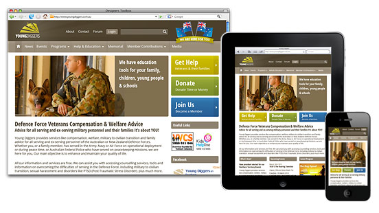
An example of a responsive design
For most businesses wishing to promote themselves in the mobile space a responsive website will be the best solution. It is future friendly and encompasses not only mobile phones but other devices like tablets and netbooks. Even if only a very small percentage of your current traffic is mobile it is worth considering responsive design for any new website being built today.